
Deploying a standalone landing page site for Goodwill Dallas' annual fundraising event, THE LUNCH, with GoHugo.io
Case study / thelunch.info

Goodwill works, so people can.
Introduction
The Lunch, Goodwill Industries of Dallas' annual fundraising event, found wonderful success for its first two years – securing over $1.5m each year to, “... expand and enhance job training services.”
For 2017, I suggested a revamp of how to present the event and guest speaker information to visitors and donors that would match the high level of importance that Goodwill Dallas places on the event. Prior year information was housed in a subpage of goodwilldallas.org — but this year I wanted to do better.
My proposal was accepted and with that I got to work planning out a standalone landing page: thelunch.info. The following is my written case study recounting the various aspects of the project from ideation to deployment, along with detailed analysis of the major development roadblocks that came about and my solutions.
Objective
I wanted this site to be fast (like, really fast), compatible with IE10/11+, responsive with a mobile-first approach, and accessible with client editable content wrapped up in an SSL.
Project details
- Client
- Goodwill Industries of Dallas, Inc.
- Project
- Stand-alone site for Goodwill Dallas' annual fundraising event, THE LUNCH.
- Site name
- THE LUNCH 2017
- Site URL
- thelunch.info
- Repo URL
- https://github.com/milleradagency/GOOD-Lunch
- Standards
- HTML5
- CSS3
- JavaScript
- Libraries & third-party plugins
-
Click to expand
- Animate.css
- A cross-browser library of CSS animations. As easy to use as an easy thing.1
- Cloudflare
- Cloudflare, Inc. is a U.S. company that provides a content delivery network, Internet security services and distributed domain name server services, sitting between the visitor and the Cloudflare user's hosting provider, acting as a reverse proxy for websites.2
- FontAwesome
- Font Awesome gives you scalable vector icons that can instantly be customized — size, color, drop shadow, and anything that can be done with the power of CSS.3
- GitHub Pages
- Hosted directly from your GitHub repository. Just edit, push, and your changes are live.4
- Google Analytics
- Google Analytics lets you measure your advertising ROI as well as track your Flash, video, and social networking sites and applications.5
- Google Fonts
- Google Fonts ... is an interactive directory of free hosted application programming interfaces for web fonts.6
- Hugo
- Hugo is a static HTML and CSS website generator written in Go. It is optimized for speed, easy use and configurability. Hugo takes a directory with content and templates and renders them into a full HTML website.7
- jQuery
- Cross-platform JavaScript library designed to simplify the client-side scripting of HTML.8
- Modernizr
- Modernizr tells you what HTML, CSS and JavaScript features the user’s browser has to offer.9
- SCSS
- Sass is the most mature, stable, and powerful professional grade CSS extension language in the world.10
- Twitter Bootstrap
- Bootstrap is the world’s most popular framework for building responsive, mobile-first sites and applications. Inside you’ll find high quality HTML, CSS, and JavaScript to make starting any project easier than ever.11
- CodePen
- Detect Internet Explorer (IE) up to version 11 and Edge (12+)12
- Material Design Box Shadows13
- Sticky Slider Navigation14
- Tinted Hero15
Development
i. Development – Research
This project didn’t need a database, that was clear, so I opted for using a static-site generator. Going flat-file granted me the speed I desired and using an SSG, coupled with hosting via GitHub Pages, allowed me to quickly draft and deploy.
After some research on the top hotness platforms like Jekyll, Hugo, and whatnot – I decided to give Webhook a try; the platform proclaims to be, “the easiest way to build a custom CMS for your next website–” which would provide the client with an easy way to push updates.
I really love Webhook! It uses the SWIG templating language, has pretty good documentation, and was really easy to write in. Unfortunately, I encountered problems when trying to slap an SSL certificate on the site that was (at that time) hosted on Webhook’s own system. It can be done, by hosting the architecture on your own servers, but I was on a deadline that the client just cut in half — I, therefore, had to find a different path.
Having previous experience with Hugo, it seemed the next best thing for this project. Hugo, “a fast and modern static website generator,” is a wonderful system that, while still technically in beta (v0.20.7 as of this writing), performs and delivers exceptionally well! It’s written in Go, or Golang, and while the docs seem disjointed at times – the community proves enthusiastic, robust, and knowledgeable. Hugo, being completely static, lacked any sort of CMS or user-friendly front-end system, so I planned on implementing a third-party solution such as Forestry or Netlify.
So now I had a plan: build with Hugo, write content in Markdown, and configure a simple CMS solution with Forestry.io.
ii. Development – Planning
I started with some wireframe sketches; the conceptual layout of the landing page took on various aspects of lessons I’ve learned and read about — captivating hero image with a simple intro and engaging CTA, elongated explanation with some statistics, easy navigation, etc.
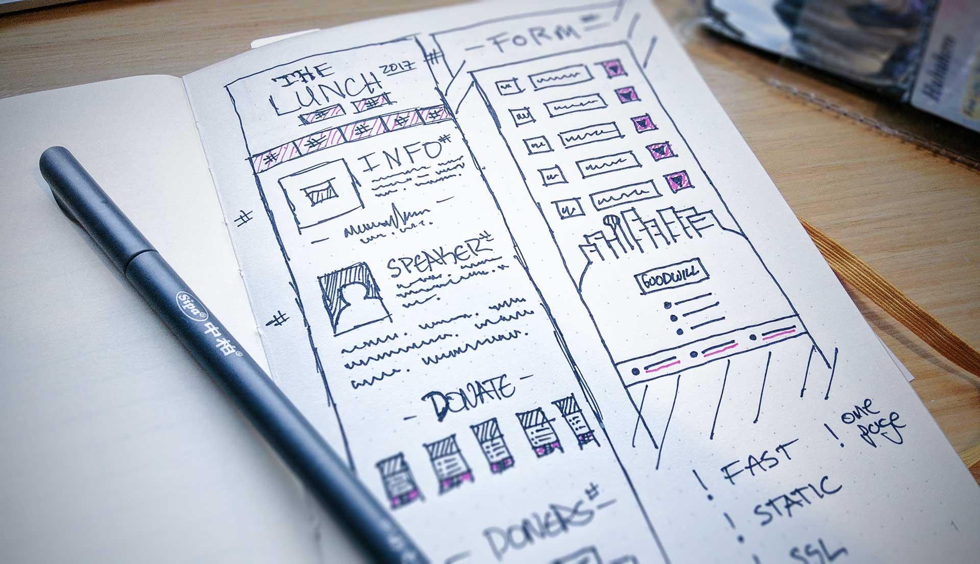
Always a good idea to sketch some simple wireframes when starting a new project
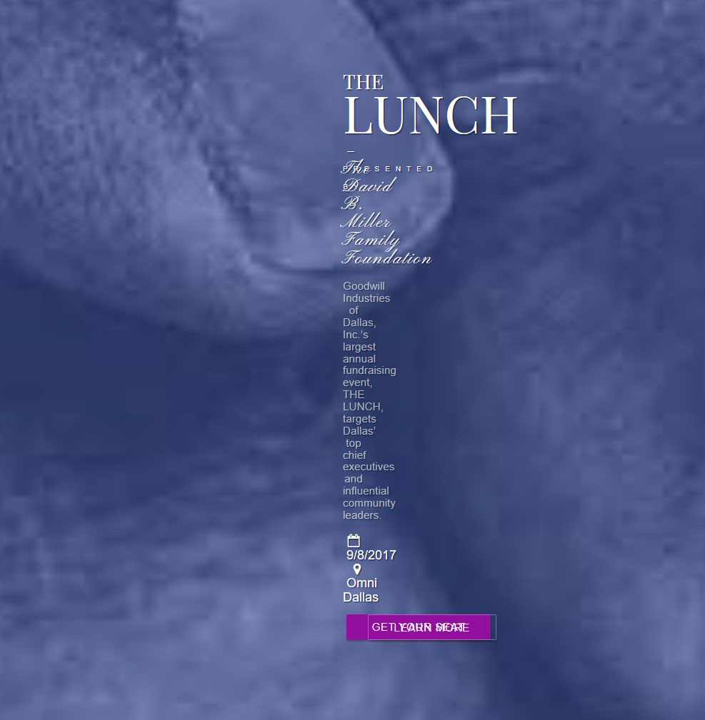
At this point, the client sent over some print materials they whipped up in-house; the pieces included key information for the page, as well as a branded visual identity to go with it.
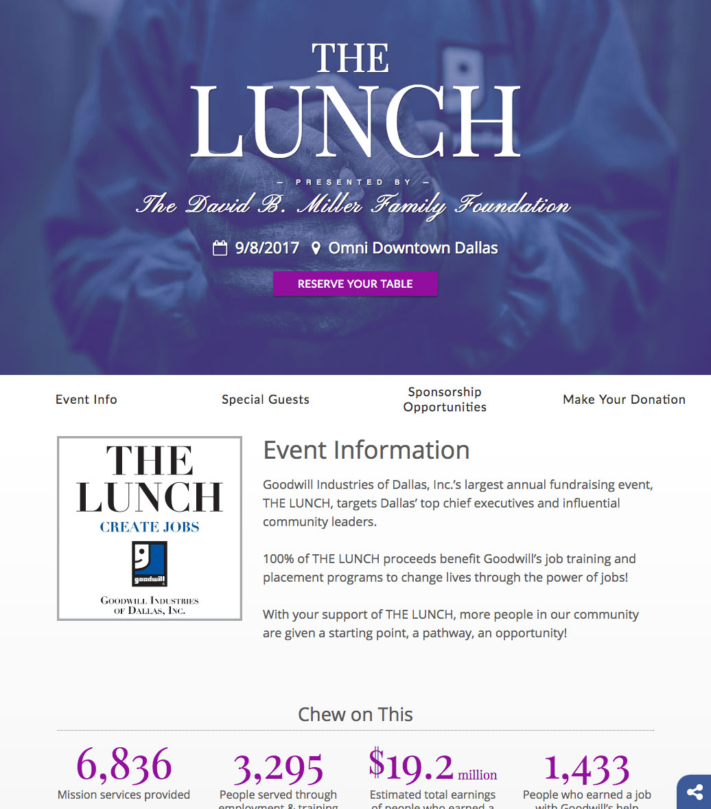
Screenshot of THE LUNCH's hero and intro sections
iii. Development – Construction – DOM
Sections & partials
The initial DOM structure is pretty simple: header, meta, styles, index sections, footer, and scripts; nothing too fancy! Hugo provides a nice templating syntax for creating a dynamic-development that compiles to a static index file. The index.html file for this landing page looks like:
{{ partial "header.html" . }}
{{ partial "main.html" . }}
Hah! Simple, right? Okay, but we both know that’s not the whole site — let’s look through the rest of the header.html partial markup.
I won’t bore you with the rest of the partials – but if you’re crazy and want to look it over, click the accordion links below.
-
{{ partial "meta.html" . }}
-
{{ partial "chromeframe.html" . }}
<style> .chromeframe { text-align: center; position: absolute; top: 0; right: 0; bottom: 0; left: 0; z-index: 999; background: white; height: 100%; width: 100%; padding: 35px; opacity: .85; font-size: 1.5rem; } </style> -
{{ partial "nav.html" . }}
-
{{ partial "socialShare.html" . }}
And, if you’re really up for some fun (you masochist) you can look over the full index.html file over on the repository.
iii. Development – Construction – SCSS
Even though many blogs say that CSS preprocessors are on their way out, due to CSS Grids rising up and coming to life, I still love SASS/SCSS.
I have a simple repo for my file structure which gives me an easy boilerplate when starting new projects via bower install pansky-sass --save.
The primary organization for my SCSS is as follows:
// PARTIALS
// Mixins, definitions (colors, font-families),
// functions, selectors, etc.
@import 'partials/!module';

// VENDORS
// 3rd-party vendor styles (normalize,
// bootstrap), etc.
@import 'vendors/!module';

// BASE
// Global styles such as non-vendor resets,
// typography, etc.
@import 'base/!module';

// COMPONENTS
// Resuable / independant module components
// (buttons, sliders, etc.)
@import 'components/!module';

// LAYOUT
// Styling for larger layout components;
// e.g. nav, header, footer, etc.
@import 'layout/!module';

// PAGES
// Page-specific styling, such as homepage, if necessary.
@import 'pages/!module';

// THEMES
// Styles for different themes; such as holidays, events, etc.
@import 'themes/!module';
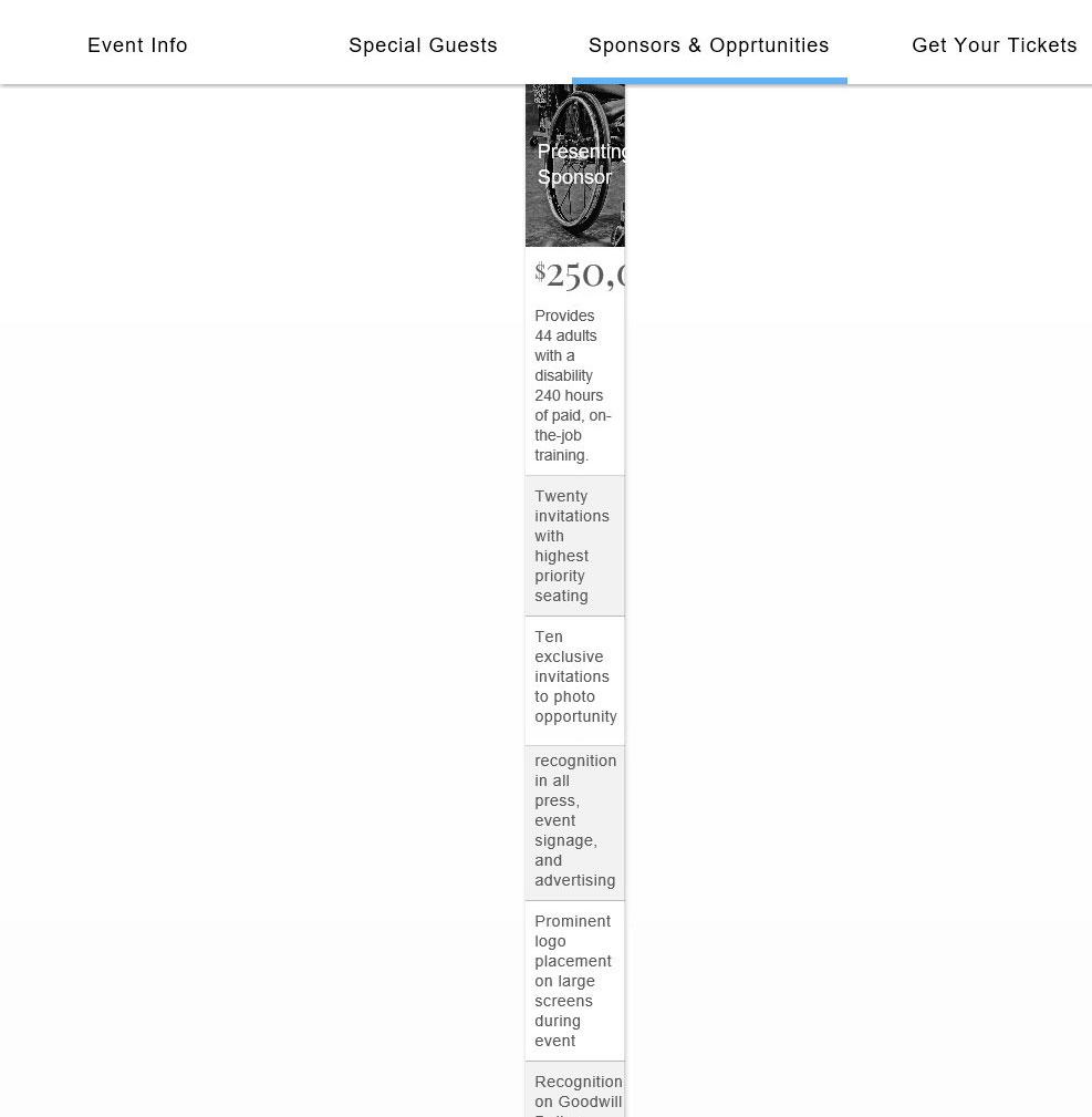
Sponsorship cards
I wanted the elements that housed the details and benefits for sponsoring the event to look pretty slick, professional, and appealing. Using a ‘pricing table’ aesthetic, I designed some responsive cards from Bootstrap’s base component.
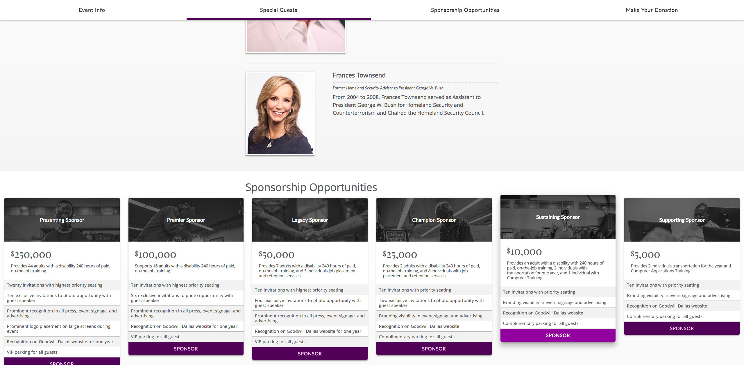
Sponsorship cards for THE LUNCH
Here’s a working example of two of the cards in action:
$250,000
Provides 44 adults with a disability 240 hours of paid, on-the-job training.
- Twenty invitations with highest priority seating
- Ten exclusive invitations to photo opportunity with guest speaker
- Prominent recognition in all press, event signage, and advertising
- Prominent logo placement on large screens during event
- Recognition on Goodwill Dallas website for one year
- VIP parking for all guests
$100,000
Supports 16 adults with a disability 240 hours of paid, on-the-job training.
- Ten invitations with highest priority seating
- Six exclusive invitations to photo opportunity with guest speaker
- Prominent recognition in all press, event signage, and advertising
- Recognition on Goodwill Dallas website for one year
- VIP parking for all guests
iii. Development – Construction – Javascript
I’m still learning my way through vanilla JS (shoosh, we all start somewhere), but this was a live client project and I used jQuery. I wrote small .animate() scripts for fading in elements and early-version mobile controls, while turning to StackOverflow, as we all do, for resolutions on how to prevent automatic browser scroll on refresh, etc; all items are credited in the comments.
-
lunch2017.js
// Document [when website] loads
$(document).ready(function() {
  $("main").animate({
    opacity: 1,
  }, 500, function() {
    // Animation complete.
  });

  $("nav").animate({
    opacity: 1,
  }, 1000, function() {
    // Animation complete.
  });

  $("#bbox-root").delay(2000).fadeIn("slow");
});


// #mobileNav controls
$(function() {
  // open/close mobile nav
  $("#mobileNavBar").on("click", function() {
    if ($("#mobileNav").hasClass("showMeMore") == false) {
      $("#mobileNav").addClass('showMeMore');
      $("body").addClass('noscroll');
      $("#mobileNavBars i").toggleClass('fa-share-alt fa-times');
      $("#navFade").toggleClass('hidden visible');
    } else {
      $("#mobileNav").removeClass('showMeMore');
      $("body").removeClass('noscroll');
      $("#mobileNavBars i").toggleClass('fa-times fa-share-alt');
      $("#navFade").toggleClass('visible hidden');
    };
  });
});


// Prevent automatic browser scroll on refresh
// http://stackoverflow.com/a/18633915
$(window).on('beforeunload', function() {
    $(window).scrollTop(0);
});


// Prevent a#SECTION from being added to URL on click
// http://stackoverflow.com/a/20215413
$('.mainShow').click(function(event){
  event.preventDefault();
});
$('.btn').click(function(event){
  event.preventDefault();
});


// Detect IE and change if needed
// https://codepen.io/gapcode/pen/vEJNZN
function detectIE() {
  var ua = window.navigator.userAgent;

  // IE 10
  // ua = 'Mozilla/5.0 (compatible; MSIE 10.0; Windows NT 6.2; Trident/6.0)';

  // IE 11
  // ua = 'Mozilla/5.0 (Windows NT 6.3; Trident/7.0; rv:11.0) like Gecko';

  var msie = ua.indexOf('MSIE ');
  if (msie > 0) {
    // IE 10 or older => change flex to block to avoid flex-wrap bug
    $(".card .card-block").css("display", "block");
  }

  var trident = ua.indexOf('Trident/');
  if (trident > 0) {
    // IE 11 => change flex to block to avoid flex-wrap bug
    $(".card .card-block").css("display", "block");
  }
}


// Run if iOS ver = 9.x.x
// http://stackoverflow.com/a/13280432
if(/(iPhone|iPad|iPod)\sOS\s9/.test(navigator.userAgent)) {
    var btn = $("#heroButtons");
    var bar = $(".et-hero-tabs-container");
    btn.remove();
    bar.css("position", "fixed");
    bar.css("top", "0");
    bar.css("height", "50px");
    bar.css("border-bottom", "1px solid #595959");
};


// Detect Android and run
// https://davidwalsh.name/detect-android
// http://stackoverflow.com/a/18764086
var ua = navigator.userAgent.toLowerCase();
var isAndroid = ua.indexOf("android") > -1; //&& ua.indexOf("mobile");
var navi = $(".et-hero-tabs-container--top");
if(isAndroid) {
  // Do something!
  navi.css("-webkit-transform", "translateZ(0)");
  // window.location = 'http://android.davidwalsh.name';
}
iii. Development – Construction – Compiler
To compile my individual partials into a production-ready minified file, I use Gulp. Since it’s a simple, yet expandable, toolkit – Gulp provides me the power of hassle-free CSS through the following plugins:
var gulp = require('gulp');
var sass = require('gulp-sass');
var postcss = require('gulp-postcss');
var nano = require('gulp-cssnano');
var sourcemaps = require('gulp-sourcemaps');
var autoprefixer = require('autoprefixer');

gulp.task('default', function () {
  return gulp.src('themes/2017/static/css/main.scss')
    .pipe(sourcemaps.init())
    .pipe(sass()) // using gulp-sass
    .pipe(postcss([ autoprefixer() ]))
    .pipe(nano())
    .pipe(sourcemaps.write('.'))
    .pipe(gulp.dest('themes/2017/static/css'));
});

gulp.task('watch', function() {
  gulp.watch('themes/2017/static/css/**/*.scss', ['default']);
});
iii. Development – Construction – Accessibility & Compatibility
Due to the nature of the event and it’s target market, I opted to make the base font size of the document 18px. I then expanded that when configuring the REM sizes for typographic elements; p (1rem), h1-h6, ul/ol, li, etc.
The site did encounter some hiccups when testing IE11, but that was expected. Additionally, I tested the page on iOS (current + back one version) using Xcode Simulator and live devices, Android (current version) using live devices, and several breakpoints using the Emmet Re:View plugin for Chrome (pictured below).
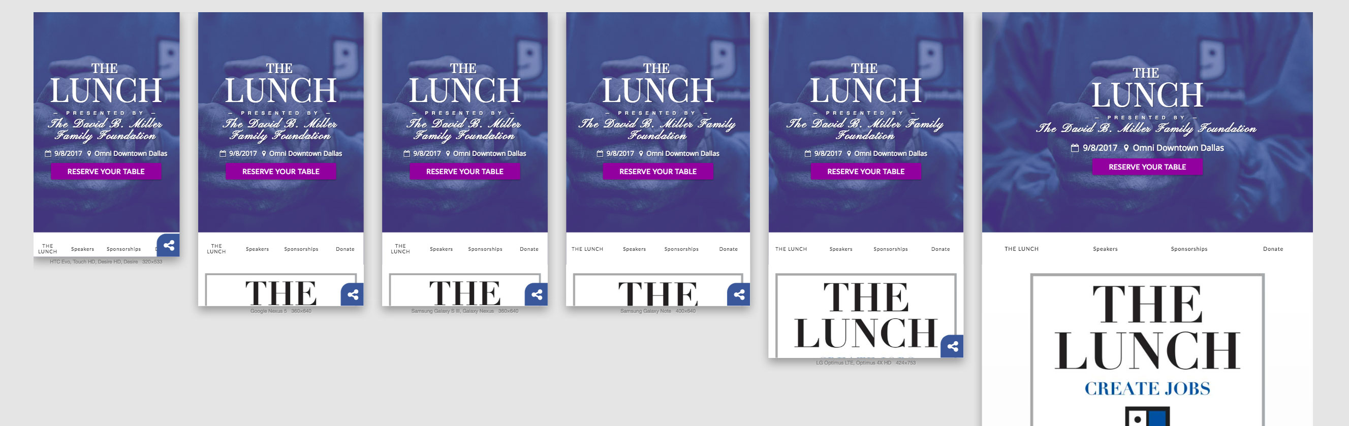
Emmet Re:View Chrome Plugin
iii. Development – Construction – Issues & Solutions
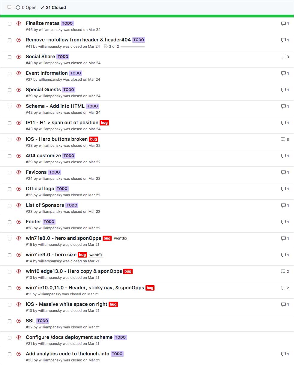
There’s always issues, always. Tracked ‘em on on the repo; the following is a view of the bigger ones:
-
#11: win7 ie10/11 - Header, sticky, & sponOpps
The hero intro sections encountered bugs on Windows 7 IE10/11.
The issue was resolved through the following tweaks:
- Add [if ie11] hero row transform: scale(0.8);
- Add [if ie11] height: 100%; to nav.et-hero.tabs
- changed hero and sponOpps from to container style="width:100%";
View issue on GitHub
-
#13: win10 edge13.0 - Hero copy & sponOpps
The sponsor/donor tier-card sections encountered bugs on Windows 10 Edge v13.
The issue was resolved through the following tweaks:
- Added [if edge] hero row transform: scale(0.8);
- Added [if edge] hero row from height: 100%; to nav.et-hero.tabs
-
#38: iOS - Hero buttons broken
"Get table" & "learn more" buttons inactive; tested on iPhone 5, works on 6s. Oddly enough, the buttons work in Xcode Simulator. Coworker's have iPhone 6SE and iPhone 5 in the office - both running on 9.3.X- version of iOS; seems that is the culprit here.
Downloaded iOS 9.3 for Xcode Simulator and found the issue to be the syntax
let self = this;in StickyNav.js line 8. Apparently,letproduces the error:SyntaxError: Unexpected use of reserved word 'let' in strict modedue to lack of support forlet.As a quick-fix (deadline approaching fast), I've implemented this bit of info to detect if the version of iOS = 9.x.x and run the following conditionals if so:
// run if iOS ver = 9.x.x
if(/(iPhone|iPad|iPod)\sOS\s9/.test(navigator.userAgent)) {
  var btn = $("#heroButtons");
  var bar = $(".et-hero-tabs-container");
  btn.remove();
  bar.css("position", "fixed");
  bar.css("top", "0");
  bar.css("height", "50px");
  bar.css("border-bottom", "1px solid #595959");
};
Deployment
Ahh, going live… such a terrifying and exhilarating time! The project hit v1.0.0 and the Deployment milestone was completed. Although, I guess I forgot to actually close the milestone – hence the date of closure.
THE LUNCH deployment milestone on GitHub
Post-release
As with any project, there were post-release updates. The site is at v1.1.7 as of this writing. Both further fixes/enchancements and client updates. To view the log, see the README.md on the repo.
This may also be the time where you’re wondering, “Wait, where’s the CMS integration?” Well, unfortunately due to time constraints, said feature never made it into the project. I continued to provide updates per client requests and wrote an extensive how-to document on how to edit the repo directly (while not breaking the site.) — which actually worked out well; site’s still runnin’!
Release v1.1.7 is, actually, just prior to the client’s editing access. You know… just in case.
Conclusion
This project was an absurd amount of fun crammed into a equally-speedy timeframe.
The first commits occurred on March 16th, while deployment was March 24th. May 16th was v1.1.7, and the client updates started June 13th.
That being said, I’m glad to have worked on it. Collaborating with Goodwill Dallas is always exciting and certainly feels like I have a sense of drive powering me when creating for them.
Sources
-
Click to view the list of sources
- Animate.css
- Cloudflare
- FontAwesome
- GitHub Pages
- Google Analytics
- Google Fonts
- Hugo
- jQuery
- Modernizr
- SCSS
- Twitter Bootstrap
- CodePen – Detect Internet Explorer (IE) up to version 11 and Edge (12+) by Mario
- CodePen – Material Design Box Shadows by Samuel Thornton
- CodePen – Sticky Slider Navigation (Responsive) by Ettrics
- CodePen – Tinted Hero by Luis Herrero
Demo
To view a demo of the site, click here.